Mint Mobile · Lead UX Researcher
Wireless Plans Page Redesign to drive a 4.5% increase in purchase conversion
A research-led initiative to optimize pricing and product structure layout of wireless plan offerings, resulting in an additional 5,401 plans sold.
- Timeline
- May 2024 – July 2024
- Company
- Mint Mobile
- Role
- Lead UX Researcher
- Participants
- 427 Total Participants
- Stakeholders
- Director of Digital Experience, VP
Background
A B2C wireless provider with 12 plan options
Mint Mobile, a B2C wireless provider, offers 12 plan options — the result of combinations of 3 payment cycles (3, 6, and 12 months) and 4 data tiers (5, 10, 15 GB, and Unlimited).
The Wireless Plans page was a key conversion touchpoint on the site, with over 60% of prospective users visiting it during their decision-making journey. However, users struggled to compare plans effectively, resulting in drop-offs and confusion. I joined this project as the lead UX researcher to simplify the plan comparison experience and increase conversions.
The Problem
70% of users never saw all the plan offerings
The current Plans page was outdated and misaligned with the redesigned product page experience. Users were overwhelmed when trying to compare plans, leading to hesitation and drop-off. Scroll data showed that 70% of users didn't reach the plan pricing table, and usability interviews revealed confusion around comparing different plans and pricing.
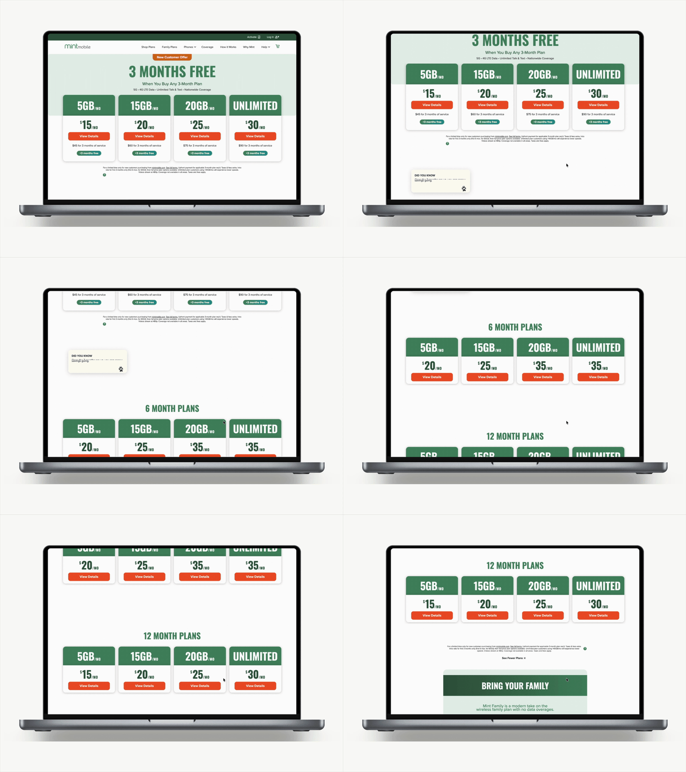
- Pricing and data amounts for 3-month plans are clearly displayed and easy to compare
- Each plan card highlights key inclusions (talk, text, data) directly beneath the data amount
- Upfront pricing is prominently listed, helping users quickly assess initial costs
- Only 3-month plans are shown by default; 6- and 12-month options are hidden under a dropdown, making them less discoverable
- Renewal pricing for 3-month plans is not clearly communicated, potentially leading to confusion or mistrust
Research Goals
I set out to make plan exploration easy and informative
The primary objective was to design a clear, inclusive, and consolidated plan-selection experience that demystifies pricing and empowers users to confidently choose the best option for their needs. As lead UX researcher, I was responsible for:
- Discovery research: conducted surveys and user interviews to uncover key pain points and needs related to plan exploration and pricing clarity
- Cross-functional ideation: collaborated with design, product, and content teams to explore and iterate on multiple layout approaches
- Preference testing: led a remote preference test with 50 participants using high-fidelity prototypes
- Stakeholder communication: synthesized and presented key findings to the Design and CRO teams ahead of A/B testing
- Live sentiment analysis: deployed a follow-up survey during the A/B test to collect in-the-moment feedback
Discovery
Users wanted every plan visible upfront.
User feedback from the survey revealed clear expectations around plan visibility and transparent pricing. Participants expressed a desire for greater clarity on what plans were available and how pricing would change after promotions ended.
Users want visibility into all plan options, not just 3-month promotional offers. Many respondents felt limited by only seeing 3-month plans and expressed interest in understanding longer-term options upfront.
"i want to SEE the 6 and 12 month plans upfront"Survey respondent
Users also expect transparency around renewal and non-promotional pricing.
"I didn't know this was an introductory rate. I need to know how much it regularly costs and when I'll be charged." Survey respondent
Initial Designs
I collaborated with design team to ideate two concepts
User feedback revealed a key frustration: inability to easily compare plans across different data amounts and durations. To address this, we aimed to surface all GB and term-length options in one unified area to enable more confident decision-making. I collaborated with the design team to explore two directions:
Design 1 — Tabbed Interface
Users could toggle between 3-, 6-, and 12-month plans for a side-by-side view of pricing and inclusions.
Design 2 — 12-Cell Grid Layout
A visual matrix displaying all combinations of data buckets and plan durations to simplify comparison at a glance.
Preference Testing
Qualitative feedback was more valuable than quantitative results
To assess which prototype better supported user understanding and plan comparison, I conducted a preference test on UsabilityHub with 50 participants.
Since the results were fairly split, we synthesized pros and cons for each layout using participant feedback to guide an informed hybrid design decision.
- Tabbed layout — clean, minimal, easy to digest, but difficult to compare plans side-by-side
- Grid layout — everything visible at a glance for side-by-side evaluation, but can feel dense on small screens
"All the prices are in one table. Having to flip back and forth is laborious and time/energy wasteful."Preference test participant
Final Designs
We landed on a responsive hybrid design.
Based on testing and qualitative feedback, we adopted a responsive hybrid approach: a grid layout for desktop to support easy side-by-side comparison, and a tabbed layout for mobile to maintain clarity on smaller screens. This balanced user needs across devices while honoring core UX principles of clarity and efficiency.
Desktop and mobile designs before A/B testing
A/B Testing
The redesign significantly lifted plan sales by 4.5%.
The quantitative research team ran a two-week A/B test comparing the original Plans page (control) with the redesigned variation (test) across all audiences, measuring click-through from the Plans page to product pages.
I also ran an on-site survey during the A/B test, collecting sentiment from 377 participants — 56% rated the redesigned page as "helpful" or "very helpful" in allowing them to compare plans and choose confidently.
These results validated our research-driven hypothesis: exposing all plans in a consolidated, scannable layout empowers users to make informed decisions and boosts overall business performance.
Impact
A shift in business priority and new website framework
This A/B test marked a significant win for both user experience and the business — a major shift from exclusively promoting 3-month plans to confidently showcasing 6- and 12-month options.
User impact
- Clearer pricing and plan comparison helped users feel more confident comparing all products
- Made value and savings more transparent
Business impact at scale
- Higher revenue from larger orders
- Stronger customer commitment and retention
- Powered promo campaigns by clearly showing savings across plans
- New design framework established, supporting 3 more A/B tests on layout, pricing, and messaging
Key Challenges
Split results made the decision harder.
Split preference test results. One of the biggest challenges was making a recommendation from a preference test that yielded no clear winner. We focused on presenting qualitative soundbites and user-centered rationale to stakeholders, helping us align on the hybrid solution.
Designing for flexibility. It was essential to build a layout that could support future promotional pricing and markdowns without disrupting the core comparison experience.
Tight timelines and shifting priorities. Balancing research rigor with evolving business needs meant working quickly and cross-functionally to keep insights actionable.
Reflection
Establishing an iterative research and testing philosophy
This project was one of the most fulfilling research initiatives I've worked on — not only because of its business impact, but because it changed how internal stakeholders viewed the role of user research in product development. It proved to be the most successful design rollout to date and set a precedent for relying on data to create impactful solutions.
Interested in more?
Check out my other work →
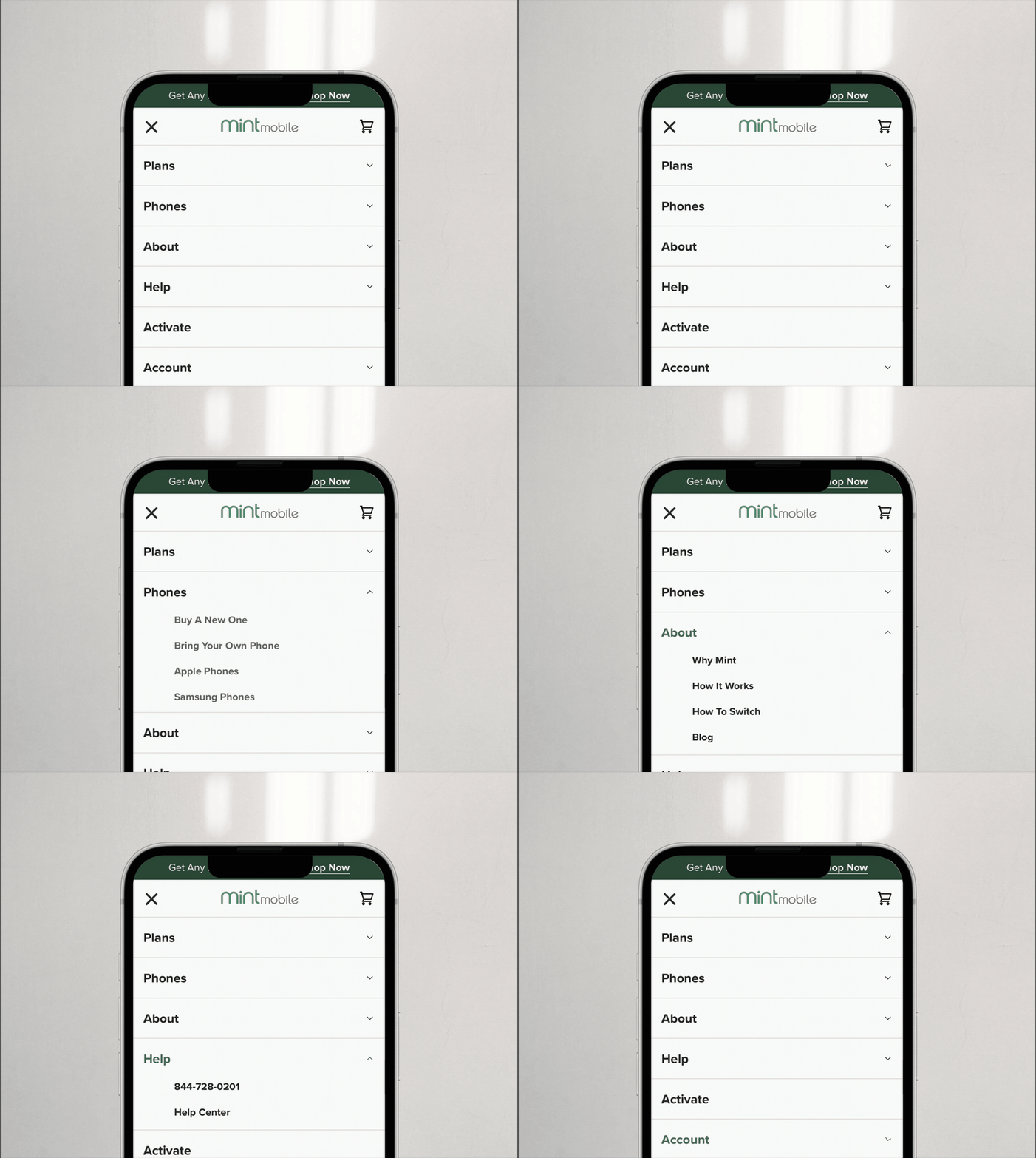
Redesigning Navigation Menus to Complement User Mental Models
An information architecture revamp grounded in card sorting and behavioral data, driving a 2.8% increase in cell phone plan sales.
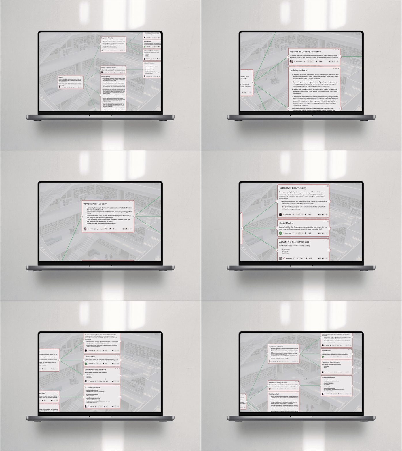
Experimental Design to Test Formats for Better Learning
A mixed-methods study on knowledge visualization formats, showing hybrid structures boost comprehension by 9.8% over linear text.