Mint Mobile · Lead UX Researcher
Redesigning navigation menus: an IA revamp to drive a 2.8% increase in cell phone plan sales
A research-led initiative to optimize site navigation and improve content discoverability through user-centered information architecture.
- Timeline
- June 2024 – Nov 2024
- Company
- Mint Mobile
- Role
- Lead UX Researcher
- Participants
- 20 participants
- Stakeholders
- Senior Director, VP, AVP of Product
Background
A B2C wireless provider with an outdated main navigation
Mint Mobile is a B2C wireless provider with no physical stores, so the website is the main storefront and support hub, making intuitive navigation key to user success. The main nav plays a crucial role in helping its broad audience, including many older, less tech-savvy users, get to key actions like choosing a plan or finding help. However, it hadn't been updated since 2020. I was brought in as lead UX researcher to lead a full redesign of the site's information architecture.
The Problem
Navigation lacked proper and relevant categorization
Key content was buried and unimportant pages were over-emphasized, making it difficult for users to find what they needed.
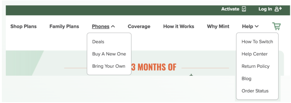
- Top-converting pages were left-most and most accessible
- Help / About pages weren't categorized (e.g. Coverage, How it Works, Why Mint), leading to overall clutter
- High-converting blog pages the content team aimed to boost for SEO weren't included in the main navigation, despite strong performance
- Account management pages (Activate, Log In) were inconspicuous
Research Goals
Create a more intuitive structure grounded in mental models
As lead UX researcher, I was responsible for:
- Uncovering users' mental models of current navigation content via open card sort
- Analyzing click behavior on current navigation to inform which pages should be prioritized
- Conducting a heuristic evaluation to align the navigation with UX best practices
- Proposing a new navigation variation that synthesizes qualitative and quantitative findings
- Collaborating with the CRO team to A/B test the proposed navigation against the current one
Open Card Sorting
20 participants completed an open card sort
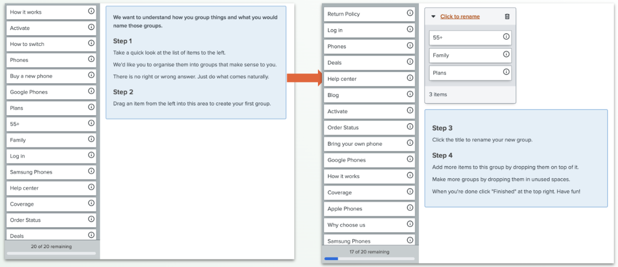
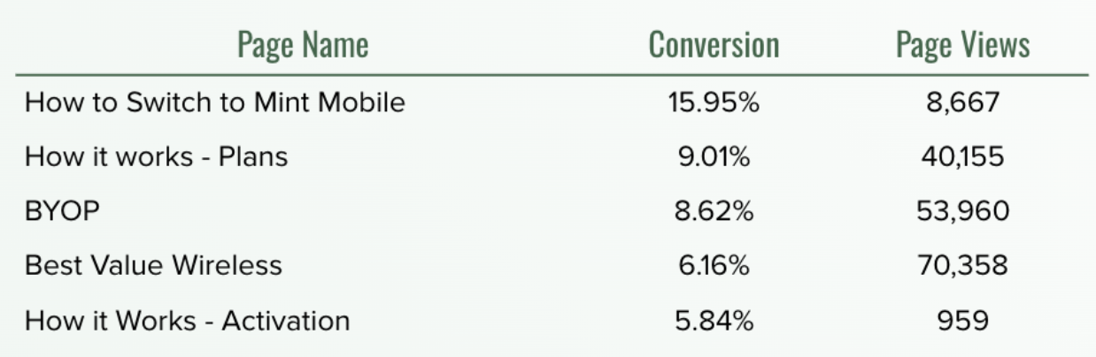
To better understand how users naturally categorize site content, I conducted an open card sort using OptimalSort with 20 participants. The sort used pages already in the existing navigation, plus additional pages outside the core purchase funnel that still strongly influenced purchasing decisions.
Card Sort Results
Four clear user categories that felt most intuitive
8 of 19 participants paired the same cards together at least 50% of the time.
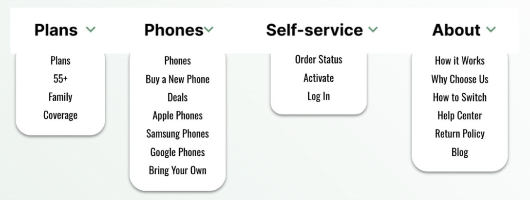
While these groupings were helpful, I still needed to compare them with real site data to make sure they matched how actual users think and behave.
User Behavior Analysis
Site behavior showed users engaged with Plans, Log in, and Cart
Using Contentsquare, a behavioral analytics platform, I looked into site click data from the past 30 days. Clicks, hovers and attention metrics showed which links users engaged with the most and least. There was high interest in Log In, Shop Plans, and Cart and low engagement with Why Mint, How It Works, Help, and Coverage pages.
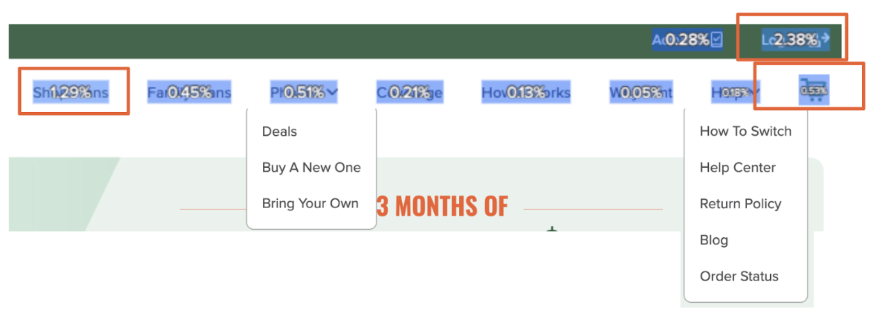
Synthesizing this data with card sort results, I knew that on top of the common groupings of card sort: Plans, Phones, Self Service and About, I needed to provide easy click access to Plans, Login and Cart in the proposed design.
Heuristic Evaluation
Previous design did not follow main navigation design principles
Leveraging Baymard Institute HCI studies, a repository of large-scale UX studies based on real user testing and HCI principles, I explored proven guidelines for main navigation design to guide my wireframe of the new layout.
Key takeaways were:
- Using clear, easy-to-understand labels
- Separating utility links (like Sign In, Track Order) from core shopping links
I shared these studies in conjunction with my proposed structure to the design team, who used them to build the hi-fi prototype for the new navigation.
IA Recommendation
The new design reflected clear before and after purchase pages
Based on user behavioral data, card sort findings, and best practices, I wireframed a design synthesizing all methodology-based findings.
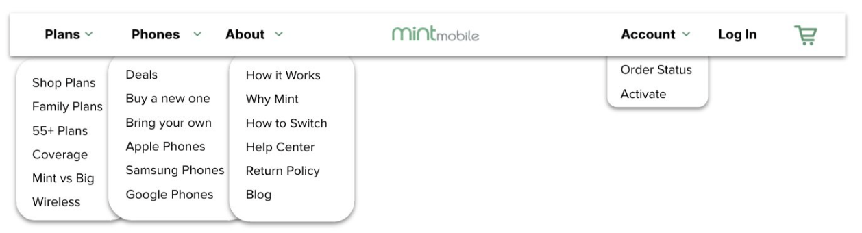
Key changes:
- Before-purchase pages like Plans, Phones, and About were grouped on the left side of the logo with clear dropdowns
- After-purchase pages like Account, Login, and Activate were grouped with Cart on the right side.
This structure allowed for clearer content grouping and improved wayfinding.
A/B Testing and Results
The redesign lifted conversion by 2.8%
To validate the new navigation, we launched a 10-day A/B test comparing the previous design (control) with the new design (863,585 visitors saw the previous experience, and 864,429 saw the new one).
Within 90 days, the redesign contributed to 10,495 additional plans sold.
Key Challenges
Complex data needed to be made stakeholder-friendly
First time experimenting with card sort. It was easy to take results at face-value, but I needed to remember that how external testers conceptualize pages might not represent the needs of our site visitors. It is a good starting point to have a baseline of groupings without bias of a real prospect's needs, but it was still important to cross-reference it with data that represented a greater population.
Creating recommendation that also matched business needs. I realized that my final wireframe would completely change the navigation of pages on the site. I had to discuss the proposed changes with the business to make sure that I wasn't hiding pages that brought the most traffic and revenue. This involved being in direct communication with analytics counterparts throughout the process before final proposal.
Simplifying complex visualizations for stakeholders. The card sort results offered complex visualizations (e.g. dendrograms, matrices, etc.) It would have been too overwhelming to showcase all the results, so I had to extract the most critical information and simplify so others could easily grasp the insights.
Reflection
A simple research methodology with big impact
This project was the websites first information architecture revamp and it was fulfilling to see how shifting links to be more visible or hidden could directly impact the user journey. The process of conducting a card sort, to leveraging analytics data, to wireframing a design recommendation was a process that increasingly challenged my analytical and creative thinking mindset. It was interesting to see how a simple testing concept could make such strong impact on the usability of the site and business metrics.
Interested in more?
Check out my other work →
Wireless Plans Page Redesign to Increase Product Visibility
Simplified plan comparison to drive a 4.5% increase in purchase conversion — 5,401 additional plans sold.
Experimental Design to Test Formats for Better Learning
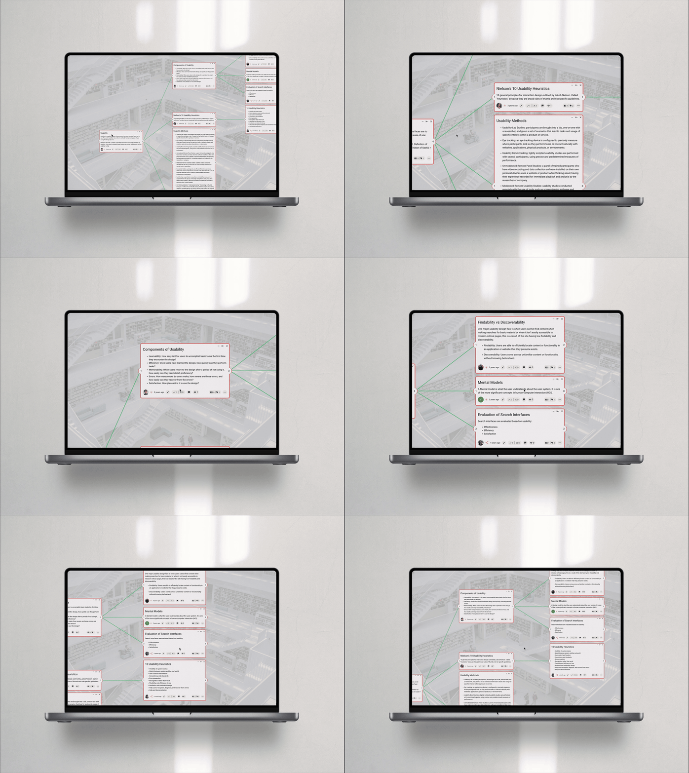
A mixed-methods study on knowledge visualization formats, showing hybrid structures boost comprehension by 9.8% over linear text.